1867 Gothic Revival – Brownsville, TN
Added to OHD on 11/10/19 - Last OHD Update: 4/12/20 -
SOLD / Archived Post
Are you the new owner? Comment below, we'd love to say hi!
823 W Main St, Brownsville, TN 38012
Map: Street
$219,000- 4 Bed
- 2 Bath
- 3500 Sq Ft
- 0.94 Ac.
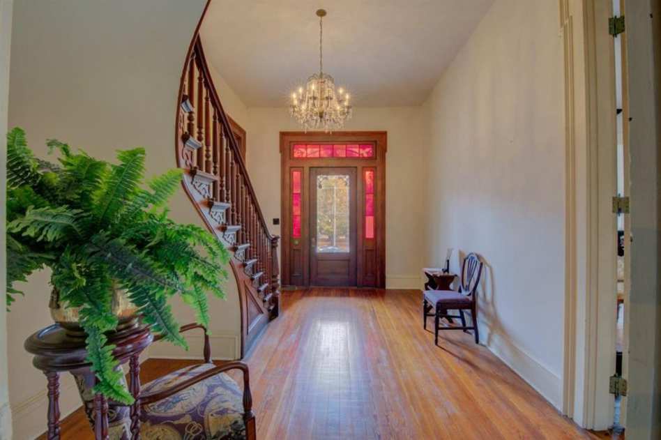
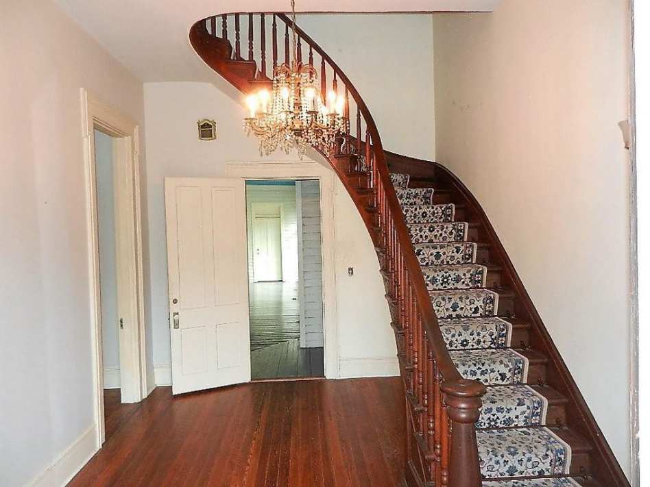
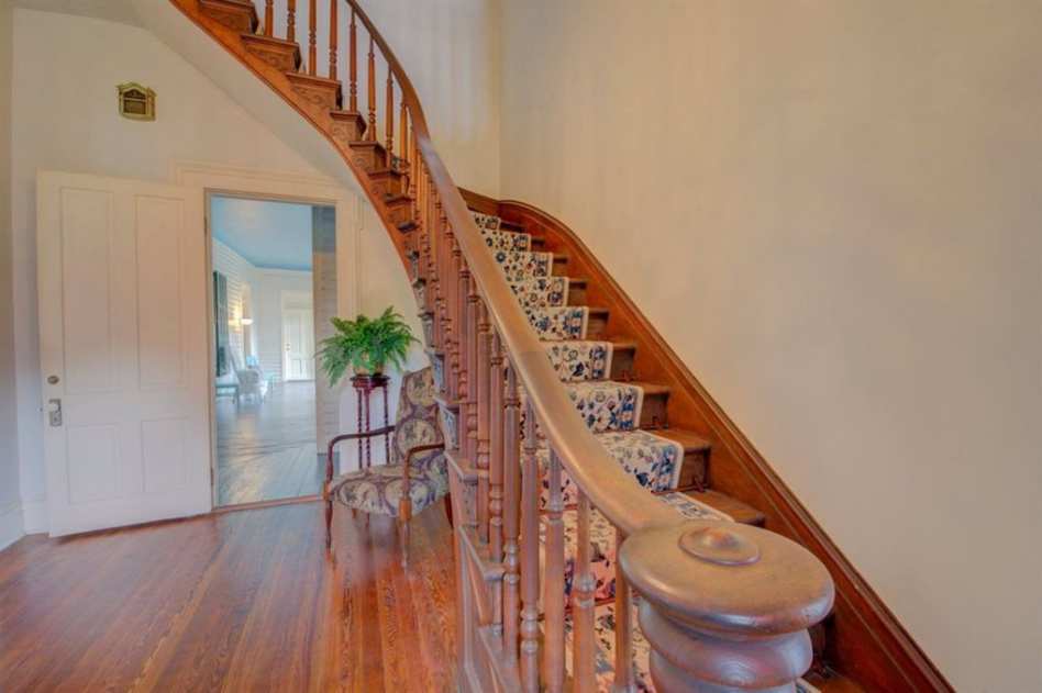
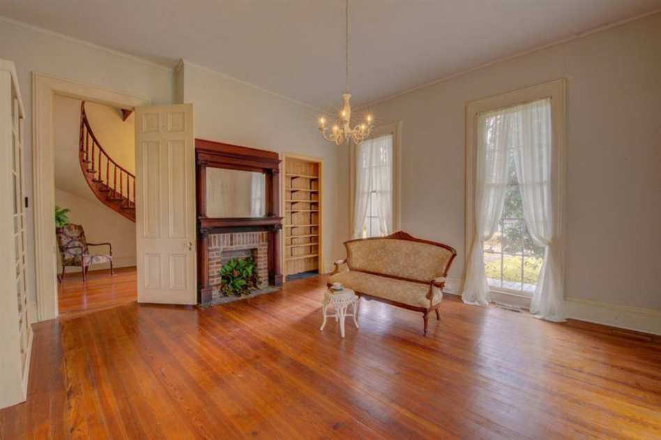
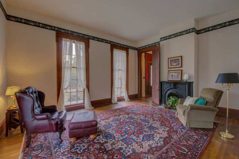
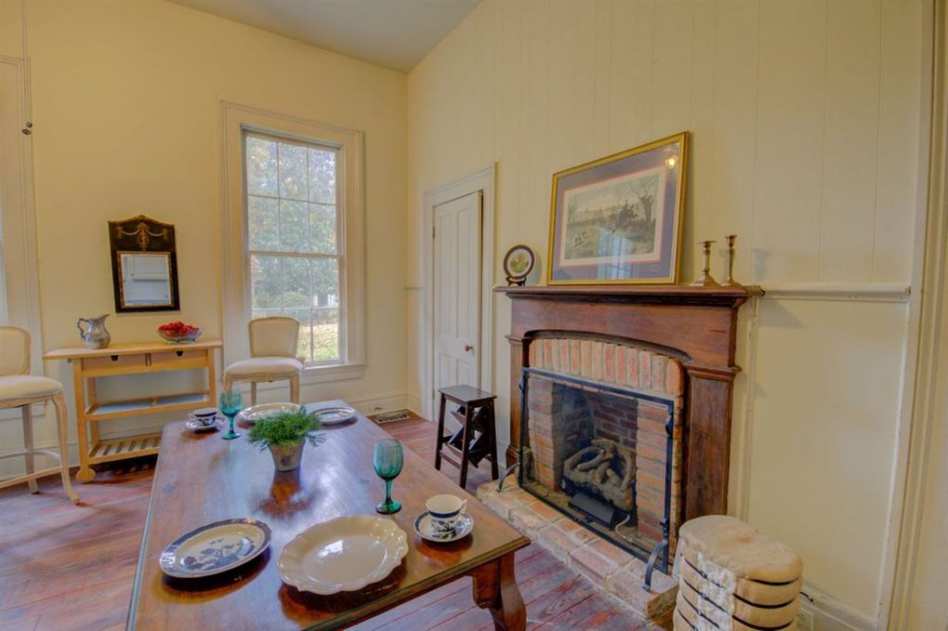
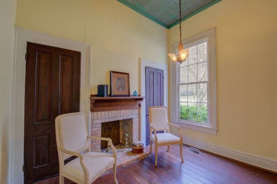
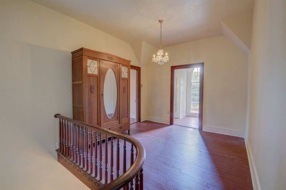
Unique Victorian style historical home with detailed gingerbread trim, winding brick walkways, wonderful wood mantels and a fabulous curved stairway. Enjoy entertaining in the private back yard with a nice waterfall and abundant patio areas.
Contact Information
Pat Cummins, Richards-Cummins Real Estate(731) 772-0713
Links, Photos & Additional Info
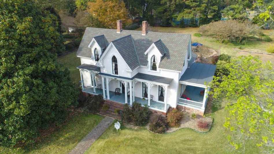
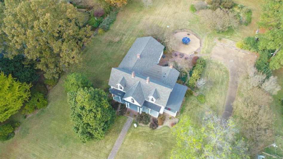
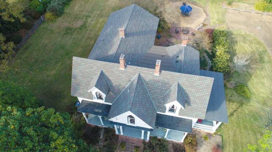
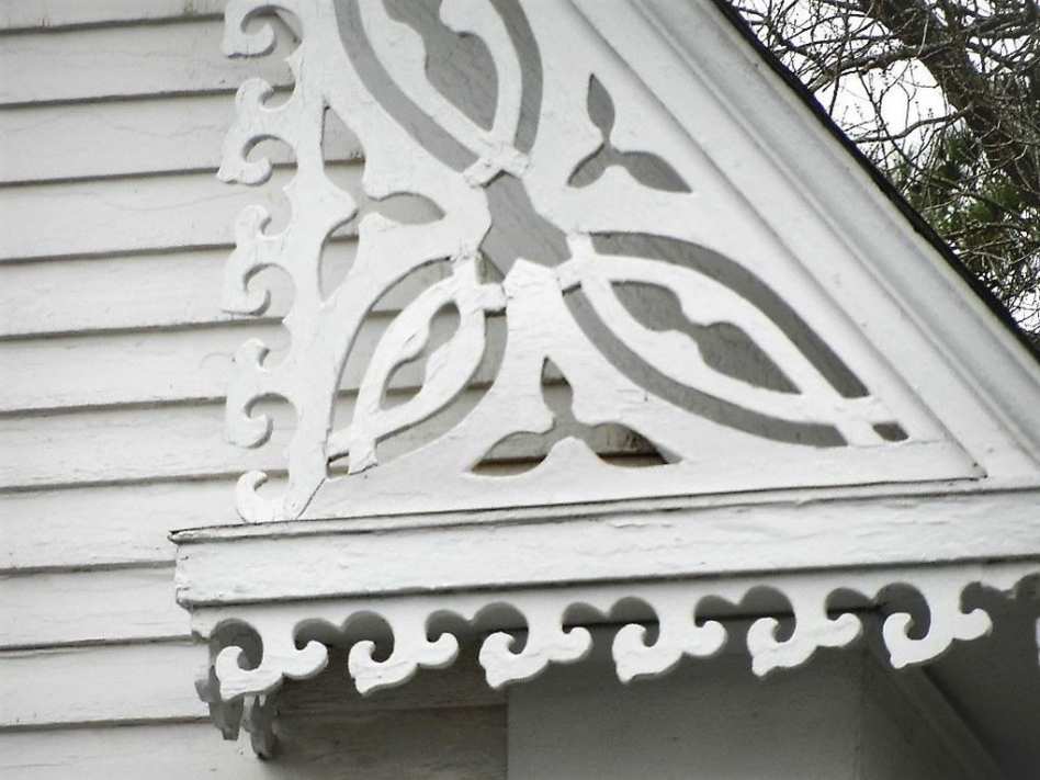
State: Tennessee | Region: South (East South Central) | Associated Styles or Type: Gothic Revival
Period & Associated Styles: Gothic Revival (1840-1880), Romantic Era
Features: Painted Wood, Unpainted Wood | Misc: Commercial/Business Use
Period & Associated Styles: Gothic Revival (1840-1880), Romantic Era
Features: Painted Wood, Unpainted Wood | Misc: Commercial/Business Use
49 Comments on 1867 Gothic Revival – Brownsville, TN
OHD does not represent this home. Comments are not monitored by the agent. Status, price and other details may not be current, verify using the listing links up top. Contact the agent if you are interested in this home.
To keep comments a friendly place for each other, owners and agents, comments that do not add value to the conversation in a positive manner will not be approved. Keep topics to the home, history, local attractions or general history/house talk.
Commenting means you've read and will abide by the comment rules.
Click here to read the comment rules, updated 1/12/20.
OHD does not represent this home. Price, status and other details must be independently verified. Do not contact the agent unless you are interested in the property.
Commenting means you've read and will abide by the comment rules.
Click here to read the comment rules, updated 1/12/20.
OHD does not represent this home. Price, status and other details must be independently verified. Do not contact the agent unless you are interested in the property.
New Germany, MN
That lovely house needs some color on the outside. What a beautiful home, inside and out.
WOW…just, W O W!!
Well, now isn’t this place just cute as h-e-double-hockey sticks! I love the exterior detail, and that staircase is to DIE for! ♥
Give me that bed!
Heehee!!! You can have the bed, Nighthorse. I’ll just grab that divine staircase and trot along. No, wait! What am I saying? I want the entire house sans that bed which has Nighthorse’s name on it. Seriously love this place. If only … Even the sky is beautiful in Photo 7 and then there’s Photo 8 with a look at the grounds. Huge thanks to the photographer for getting the best shots!!!
Am I missing some photos? I only see one bed (photo 22) and it looks like a plain old bed to me…doesn’t even have a headboard, unless I am missing something.
Built by the family of a prominent cotton planter and known as the Anderson-Austin-Moss House, part of the College Hill Historic District on the National Register:
https://npgallery.nps.gov/AssetDetail/NRIS/80003834
A lovely example of the style with especially lacey detail, the effect is muted by the all-white paint scheme inside and out – Mssrs. Jackson and Downing would not be pleased.
what colors would be appropriate on the exterior?
“A cottage or villa should be of a cheerful mellow hue harmonizing with the verdure of the country.”
“There is one color, however, frequently employed by house painters, which we feel bound to protest against most heartily, as entirely unsuitable, and in bad taste. This is white …” A.J. Downing 1847
The early designers liked lighter greens, browns and yellows, usually with darker trim. Basically any warm color was acceptable and I’ve seen pink and red, or even pastel blues that looked great. The polychrome Victorian paint schemes we see on Queen Annes probably wouldn’t be appropriate.
Interesting. The first three colors I thought of after reading your post: pale mint green, butter yellow or pale blue-gray.
I love these excerpts. I love how horrified they were at certain colors. Words like “abomination” being used to describe the effects of a white house with green shutters clashes with the surrounding landscape.
In ‘Home Interiors’ by Gardner, EC 1878, “occupants of white houses are either cold blooded formalists, prim and precise, helpless tenants of greedy, grasping landlords, or they are in some other way victims of painful circumstances.”
‘Scientific American Architects and Builders 1887 Volume IX’ states: “Only builders of the hideous white houses cling to exterior blinds”
Oh, my lord! MJG, I’ve laughed out loud upon reading those excerpts. It’s a good thing the authors weren’t living in my little village when I was growing up where every other house was white with green trim or white with red trim. Occasionally some brave soul would produce a medium yellow much to the consternation of the neighbours as in “my God, have you seen what Bill has done to the house? I can tell you if his father were alive, that would never happen.” And so it went and perhaps continues to this day.
Hahah. Same with the neighborhood I grew up in. I’ll never forget the first brave would to actually do their Victorian over in its original period color scheme. It was in the 80s. Everyone called it a circus house but with Brady bunch colors. All the old houses in the neighborhood only had two colors but this brave house had about 6 and they were very earthy. I loved it.
that explains the coton bale inthe one room.
A real beauty. Love the staircase.
That gingerbread trim is some of the prettiest I have seen. What a beautiful home this will be for someone!
Kathryn, your comment on the bed is spot on. That half tester canopy is great, and it’s in a very nice Gothic Revival cottage. Perfection.
Just a comment: The verge board in the gable, and the brackets on the main porch, look as though they were cut from modern ‘sized’ lumber, not Victorian stock, which was usually, though not always, thicker. They do show layers of paint, indicating some age. Perhaps they are a restoration from old photographs? The columns they are nailed to certainly appear to be old.
Whatever its history, a really lovely home, as Julie said, worth the price of admission!
bloody nice exterior trim work
one has to love the staircase and that bed jejeje
but minus 50 points for the kitchen that looks like a mix and match hardware store yard sale
Escondido, CA
What is with that short, fat fridge? Very odd . . .
I don’t believe I’ve EVER seen a refrigerator like that in my entire life!
I’d leave the exterior as it is. The subtle play of light off of architectural detail beats color any day. Same could be said for the interior, with the exception of the Windex room.
A really beautiful home, is that a short fat refrigerator or just camera distortion?
I think that is a commercial “low-boy” reach in fridge or freezer. Normally they are even boxier than that, so this one might be a high end product.
Ione, CA
I like the exterior in white, the interior not so much. I have no problem with the kitchen. I would hope the other bathroom has a shower.
I’d leave California to live there, it’s a terrific home…
Bartlett, IL
I think I’d change the location of the sink in the kitchen. I’d put the stove where the sink is and a smaller fridge where the range is. Then I’d build an island and face the sink in the island towards those windows! What a home!
The upstairs bath does have a shower.
What a grand staircase and the red glass around entrance door is beautiful. Looks like original wood floors in the kitchen and also love to see so much original detail, like the fireplace in the kitchen. Could imagine curling up under a big fluffy comforter in the fantastic bed in front of a roaring fire in the winter months, how cozy! I just love the details in the old houses!! They just look so warm and inviting, just begging for a family and happy gatherings.
What a grand staircase and the red glass around entrance door is beautiful. Looks like original wood floors in the kitchen and also love to see so much original detail, like the fireplace in the kitchen. Could imagine curling up under a big fluffy comforter in the fantastic bed in front of a roaring fire in the winter months. how cozy. I just love the details in the old houses.
Noblesville, IN
Gorgeous wood in the hall. Wonderful front door and surround as well. Count my vote for the delicate, subtle white exterior. 🙂
This bouse and property are the best I’ve seen posted!! The stain glass gives the room a wonderful aura,and I love the little waterfall on the patio!!! There is a lot of room for an up and growing family!!!
After picking my jaw up off of the floor all I can manage to say is wanna, wanna, gimme, gimme….please:)
Beautiful entry and staircase. The kitchen looks ‘off’ somehow. Wish there was s better idea of dimensions of the rooms. Love the house overall.
What a spectacular house! I really love the gorgeous trim and the curb appeal of this house. I agree that it needs a bit of color to show off the details, but it should be a very subtle shade. The inside is a little bland to me. I love the stairs , but it just needs a little paint, maybe some wainscoting. That odd fridge looks extremely out of place here and the kitchen needs a larger island to offset the size (looks like the removed some walls to make it larger). I really love this house! The yard would be great to add a nice inground pool while I’m dreaming, too!
Actually, previous owners had a pool but closed it in.
This house to me is just about perfection! Some changes to kitchen and there it would be. Lovely,and that staircase, my oh my….
Street view is beautiful; this house has wonderful curb appeal. Although Downing and Davis suggest earth tones for Gothic revival, I think the white works quite well. “Pick your poison”!
Interiors of this style were ALWAYS decorated with color and pattern; the white goes dead! Check out Lyndhurst in Tarrytown, New York …. it is dazzling!
Love this house ……. so much potential!
I think it’s important that folks at least know what the recommended colors were, look at photos of other similar houses, and experiment. Then if they want to paint it white, or whatever, it’s on them. There are far worse old house crimes than offbeat color choices, even ones in “bad taste”.
I fell in love with quite a few houses from black & white photos and was surprised to see them in color. It’s usually not that big a deal.
I’m not a fan of white on white paint schemes for any Victorian era house, but of course my favorite A.J. Downing-influenced Gothic Revival happens to be pink. Thirteen different shades of pink since initial construction in 1846, as a matter of fact.
CharlestonJohn, I was having this discussion with someone once about the choice of Pink for their house on the board here. A house was painted a modern Loud pink. My argument was, Queen Anne and Stick houses and Pink not being an great choice or even authentic selections for that style. Here is an example where pink is a more authentic choice to what the architects intend. If you look at some of the color schemes, its not just a bright pink house with white trim, but even sometimes I’ve seen Brown Trim, Green Trim and other odd combinations with pink. (or odd by today’s eyes)
Can you elaborate what you by 13 different shades of pink since initial construction? Which house are you referring to?
Just now saw your question. Here’s the answer…
https://www.historicnewengland.org/property/roseland-cottage/
https://www.nytimes.com/1998/09/27/nyregion/a-house-s-color-is-part-of-its-history.html
Ah yes. I know this cottage very well. I’ve been there before too. Beautiful house inside. A great place for the aesthetic movement Lyncrusta wall coverings. I noticed in my original post I intended to post a link but it’s not there. I may even been posting this one. Lol
I love Lyndhurst in Tarrytown. That exterior is a mix of stone with wood elements. Some of the wood painted the sandy color to simulate stone in some areas. The interior is a great mix of early Victorian to later aesthetic period with some of the Gothic stained glass windows being replaced by either Tiffany or La Farge (its not known which one)
love that staircase,never seen a refrig like that one before
The house is very cozy and bright. I would put the refrigerator up on a platform for easier access.
Chestatee, GA
Brand new listing photos so updated and moved to the front page. Comments above may be older and reference something in the old listing photos.
TX
Love this one!!
A note on appropriate colors for early buildings:
A note on the color, or lack of it….
As noted by Charlestonjohn and a few others above, the early exterior paints from before the Civil War, actually there was no commercially available ‘mixed’ paint before the 1860s, was mixed from scratch by the painter and his employees. The painter used coloring materials hand mixed into paint components in Downing’s Gothic Revival era and earlier.
They used natural organic materials and/or minerals for the coloring pigments. Pigments were hand ground by the painter and his crew, or ground by a horse-powered pigment grinding mill. Linseed oil was used as the binder, which helped maintain the even distribution of the paint coloring pigments. White lead or red lead as the base component in coloring, and turpentine as the ‘vehicle.’
Because linseed oil turns yellow with time, it can produce a greenish cast when mixed with blue color ingredients, or yellow cast when mixed with other pigments. That is why the early paint analysis in Williamsburg and other restorations produced a greenish or yellowish cast to paint colors. Overpainting, dirt, light, and moisture can also change a paint’s color.
So, paint colors recommended in the Gothic Revival style in books and careful paint analysis document earth tones and variations on white lead and red lead based colors.
White paint, as I understand it, became fashionable during the Colonial Revival style era of the last decade of the 1800s and the first decades of the twentieth century because of the mistaken idea that most early buildings were painted white. White paint has actually never lost its popularity. One reason is that it made Victorian era buildings ‘look’ earlier.
Thus, white paint is very wrong historically for a Gothic Revival, Italianate, Romanesque Revival (the first Romanesque Revival, not the Richardsonian Romanesque) and all building styles popular before 1850-1870.
Otis Orchards, WA
Love the staircase!
Imagine 9, I could actually see myself walking to the front door from the kitchen. It felt right.
Then I got to image 6 (I look through images [and magazines, etc.] backwards) and there was my favorite color and my numbers, 823. Kismet?